Colours for a Hampstead House
< Back to Projects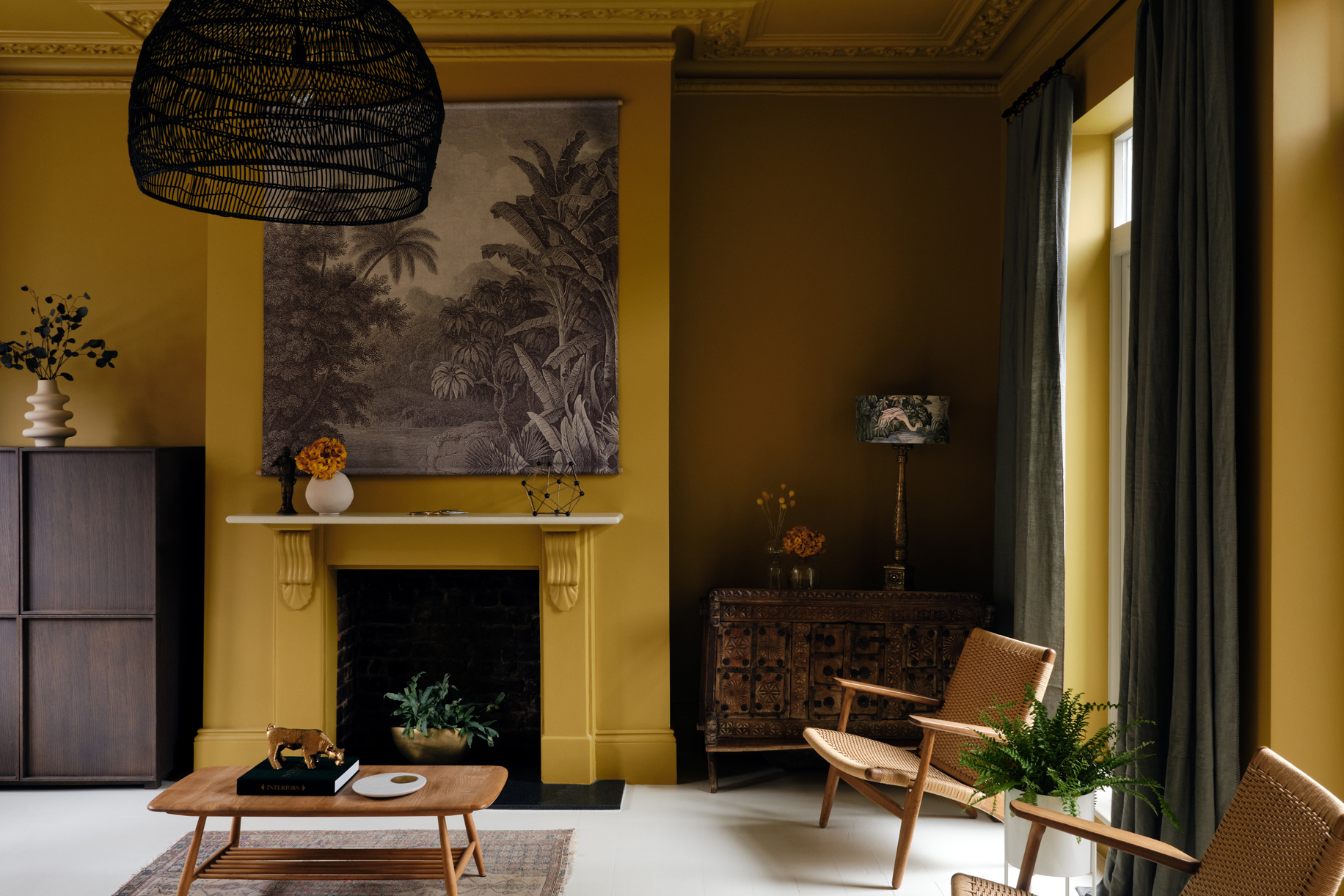
Our clients bought a fantastic townhouse in Hampstead which, although it didn’t need any work, lacked character. They wanted it to feel like their own.
The home was painted 100% brilliant white. It felt stark and quite clinical. Our solution was to bring colour to this Hampsted House. Together, we decided to create a very bespoke, complex colour scheme which would abandon white completely and embrace living with colour.
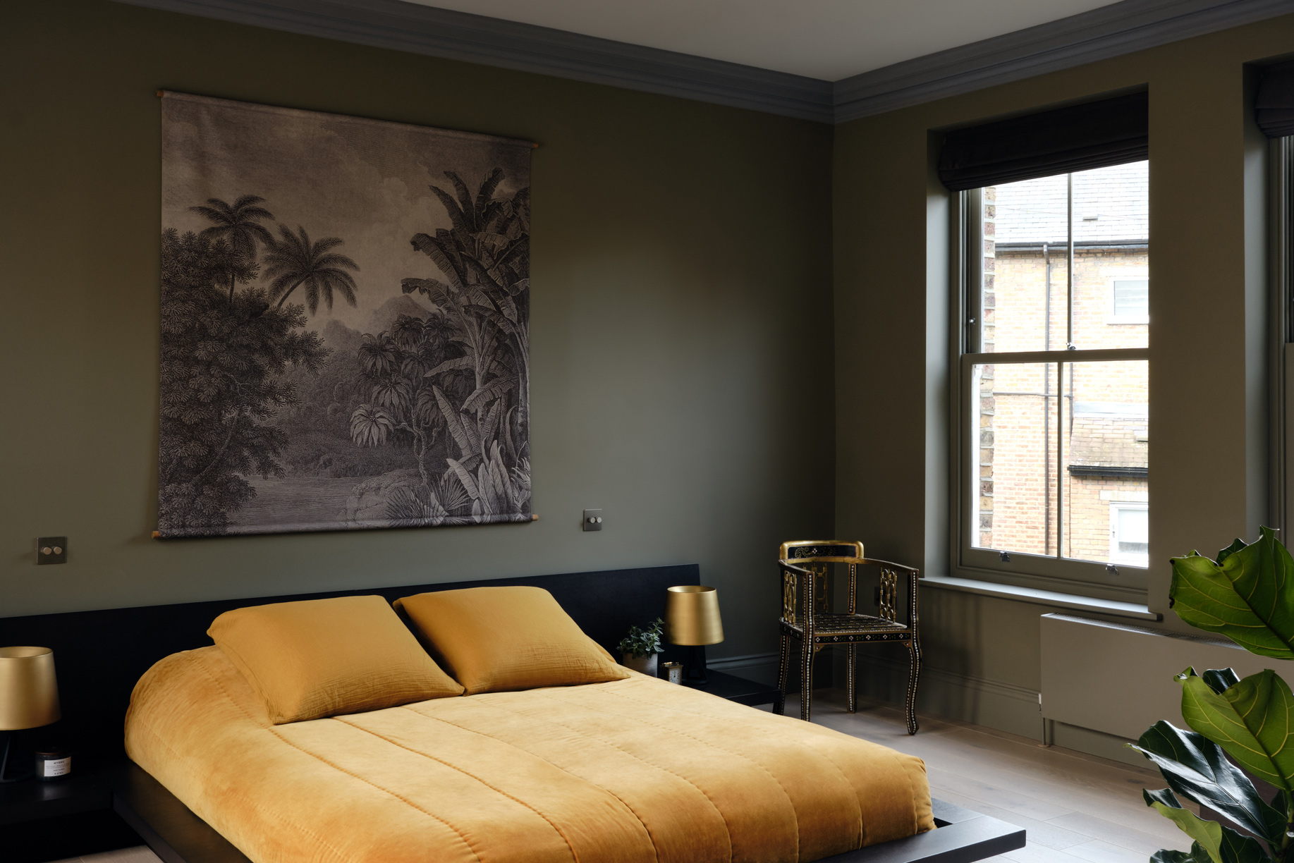
We chose softly pigmented colours – a bold mustard, alongside muted shades of blue green and purple – to create a calm, soothing and natural home environment, tempered by varied lighting that could be adjusted throughout the day.
Considering a bold renovation? Get in touch with us to talk about your project
Nature and colour
Colour deeply affects how we see the world. The natural world is vast and full of complex, muted and vibrant colours. Biophilic design principles have shown us the benefits of mimicking the natural world on our mood and outlook. This richly varied colour palette is intrinsically calming for humans.
When designing for psychological calm and wellbeing, one should look to nature’s colour palettes for inspiration, embracing rich and deeply coloured environments.
The right paint and the right colours
We created a palette of bold and earthy colours for the house, that takes inspiration from our clients furniture and soft furnishings to ensure that everything would work together.
All the paints we use, including Mylands Paints, are low VOC and almost solvent free, sustainable paints that also support our clients health and wellbeing.
Total immersion in colour
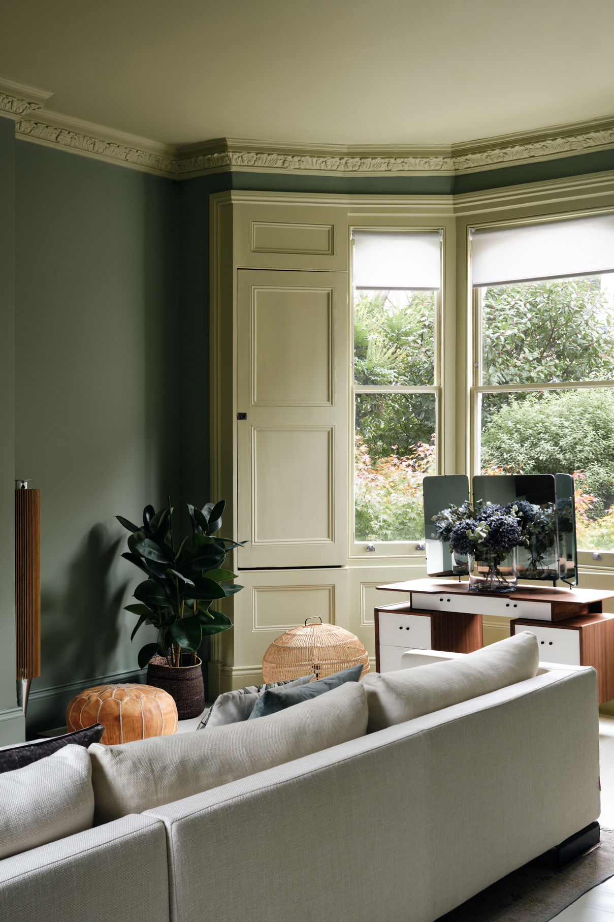
Colour-drenching, – where the walls, ceiling and woodwork of a room are all painted in the same shade, builds on the phenomenon of colour appearing differently according to the conditions. For example next to certain other colours, or in early compared to late daylight, or artificial light.
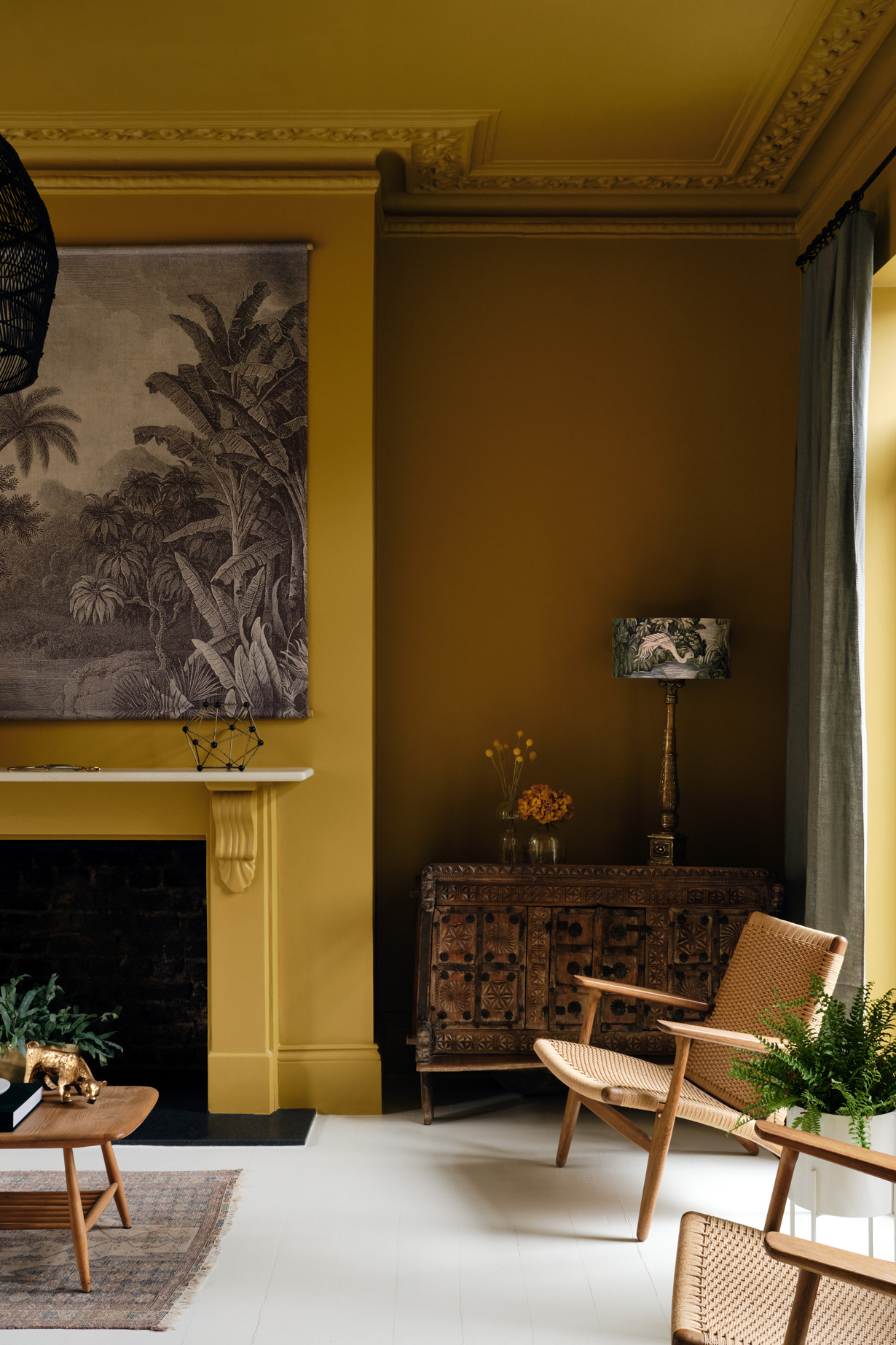
Our client’s favourite colour is mustard. We wanted to embrace this, making a feature of it in their multi-purpose family room/home office. Its deep rich tones feel like a warm hug, a room that was instantly ‘theirs’.
We came across Mylands Paints at the Dulwich Picture Gallery, where they have developed the wonderful ‘Dulwich Red’ in which the main galleries are painted. Their range of richly pigmented paints delivered with the perfect shade. Freegrove Mustard hit the right notes, being not too orange, but not just yellow.
Seeing it fade from a warm honey to a deeper caramel through the day is part of the joy of working with colour.
Transforming a house with colour
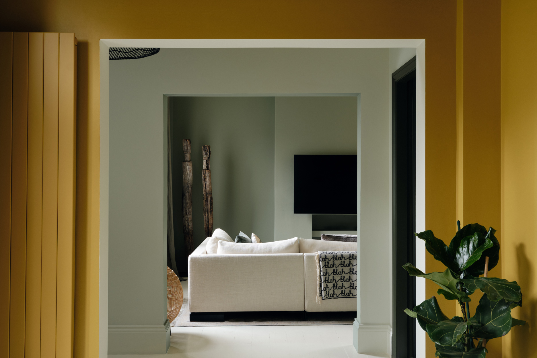
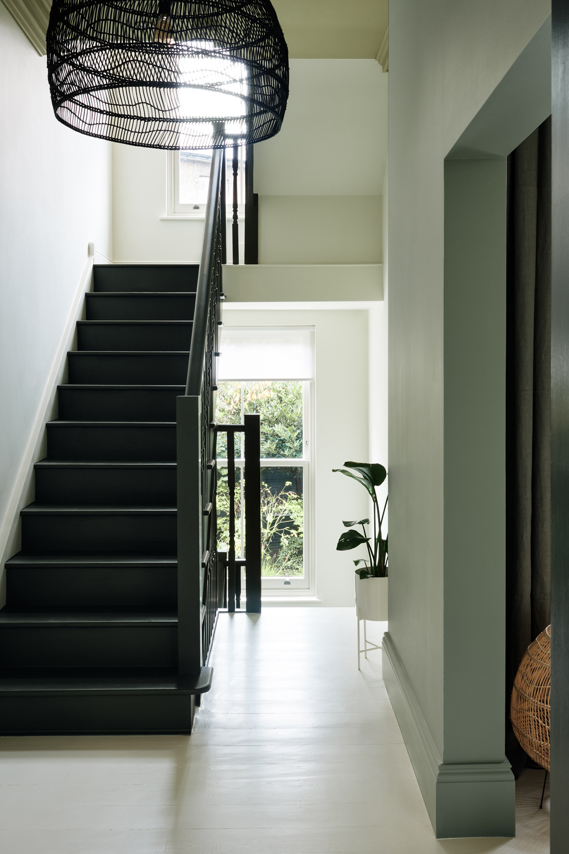
Throughout the interior of the house, we used colour that would enhance the spaces, draw attention to period details and provide a warm, calm backdrop to our client’s daily life. In creating a complex colour palette, it was important to consider the views from one room to another – enhancing the sequence of spaces and making the house more enjoyable to live in.
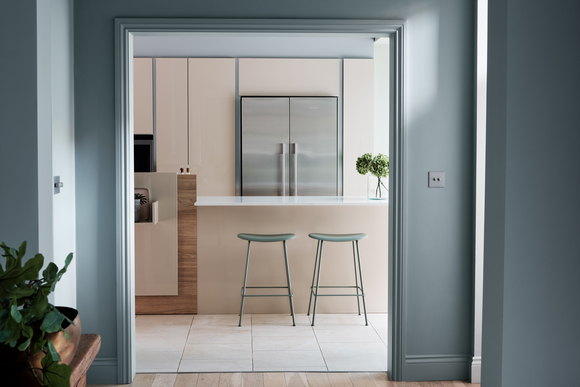
The kitchen of this Hampstead house had good quality, recently installed, but very bland beige units. Installing a new kitchen would have been expensive and unsustainable. Instead, we chose colours for the walls and ceiling that would lift it. Using a tonal combination of soft green and blue to sit alongside the beige, the room has been transformed into a sophisticated and curated space.
Treating the house as a whole
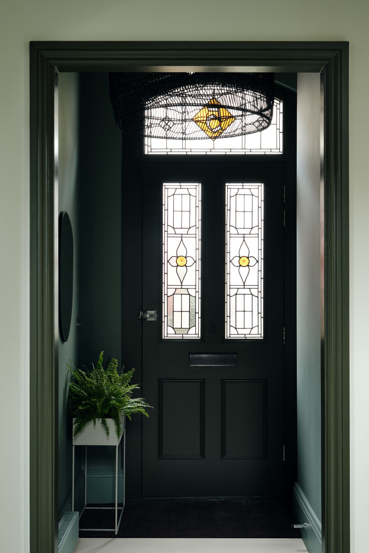
In the hall, we took a more restrained approach. We chose toning and contrasting pale tones of Myrtle Green for the walls and a rich and dark green, Messel, for the front door and woodwork.
Working with colour, and making sure the palette works with existing fixtures and fittings, furniture and objects collected over many years is a light touch and sustainable way of transforming a home.
Embracing colours in this Hampstead house has made it feel luxurious, homely and had a much greater effect than the sum of its parts.
Details
Services
- Colour Consultation Colour Consultation
Team
- Siri Zanelli
- Xanthe Wilkins
Looking to
Transform your Home?
Unsure where to start? Drop us a line to hear about a range of services tailored to your needs.
Contact us