The Power of Colour at Home
< Back to Insights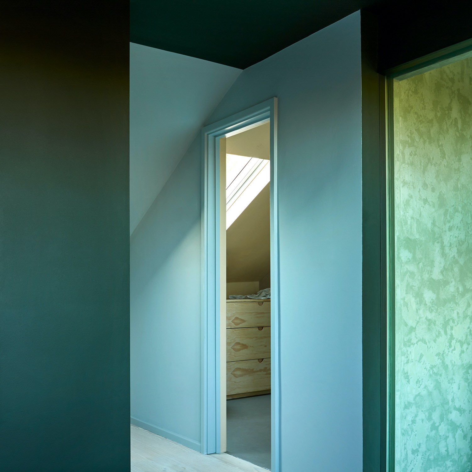
Siri Zanelli, partner at Collective Works, discussed the power of using colour at home at a talk hosted by New London Architecture (NLA) as part of their Don’t Move Improve (DMI) Lecture Series. The case study, Upside Down House – a collaborative project between Collective Works and Koi Colour Studio, is featured in the 2021 DMI awards, and shows how colour can be used as a powerful design tool to fully transform a historic, modernised home. Upside Down House is Siri’s own home and was a complete transformation of a derelict Victorian terrace in North London. The house underwent an extensive internal transformation yet it was the vibrant and bold colour scheme along with the natural material palette which made the home a truly extraordinary and exciting project.
Siri’s work is heavily influenced by her architectural training in both Japan and Norway and her time spent working within these two distinct cultures. She has long believed that timber and bricks create a perfect palette to build with and that the use of colour and natural materials has the power to enhance one’s well-being – a notion which has become increasingly supported by research and data. When Siri along with the team at Collective Works designed Upside Down House, they wanted to create a home that feels really great to be in and a safe and comforting little corner of the world for the family.
Collective Works strongly advocates for environmental and social sustainability in their work, and Upside Down house gave them the perfect opportunity to work with clay based paint brand Pure&Original Paint, with low volatile organic compounds (VOC). One way to achieve wellbeing architecturally is to design spaces that bring in loads of natural light, and create strong visual and physical connections to greenery through the use of indoor planting schemes and lines of sight to the outdoors. Great design is about creating a sequence of spaces that offer different experiences, and will work with sections to add height to a narrow plan and inject moments of surprise to a space, or even joy.
Colour at home
Colour in the home is a powerful design tool that has the ability to completely transform a space which is why they wanted to push the boundaries, in terms of colour, whilst designing Upside Down House. Colour is a tool for creating something unique, something striking, without increasing the construction budget significantly. KOI Colour studio is at the forefront of colour design, and is known for harmonious yet complex colour palettes in private Homes as well as public buildings and on facades. Siri reached out to Dagny Thurmann Moe of Koi Colour Studio (Norway), and asked if she was interested in working on a Victorian terrace with modern extensions with rich materials. She was easy to convince, but she insisted that if they wanted to work with her they had to be brave. The result is a home that has 18 different colours and not a single white surface in sight.
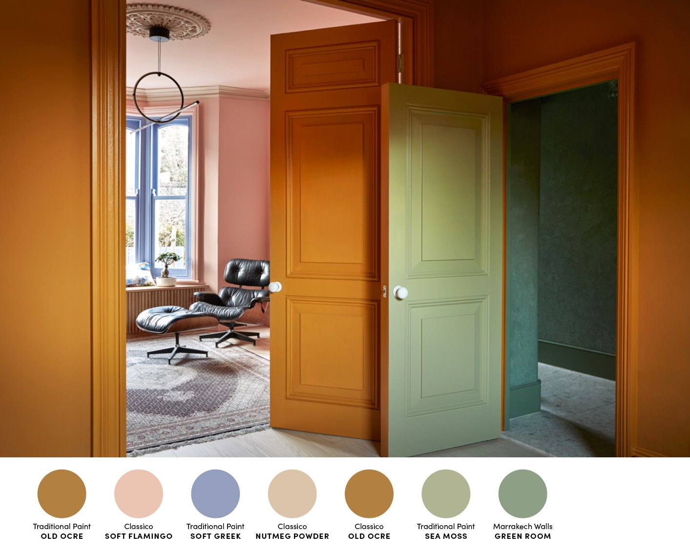
This is the material palette for the kitchen, which we took as our starting point when we chose the yellow colour for the walls. Siri is brave in the choice of materials, and recommends mixing different types of wood for depth in the expression – something we completely agree with! Wood is a kind of base colour (some would call it neutral, but it is not the correct term), which works for most other colours. Wood generally sets the limit for further development of palette and colour choices.
The below interview is a translation of an interview first published by KOI Colour Studio as a part of the launch campaign for the UpSideDown House Collection on behalf of Pure & Original paints:
Dagny Thurmann – Moe: What was important when designing a family home for yourself?
Siri Zanelli: It should fit us perfectly! That is, take into account that we are a busy, a bit noisy and a bit messy family that comes rushing in with muddy rugby boots or arms full of laptop bags, bicycle helmets and yoga mats. We are like all active families – there is a lot going on , and thus it becomes important that home is a place that is great to be – together. It was important to define the “heart of the house”, the rooms where the day both begins and ends. The kitchen room is expanded and opened towards the garden and towards the sky. By adding a small living room nook towards the garden, the room is transformed into a family room where there is also room to retreat and find some quiet time.
DTM: What has been specially adapted for this house based on the family’s wishes?
SZ: The kitchen is bespoke. We wanted a large kitchen as we love to have people over, and knew it was going to be a room where we spend all our time – therefore I did not want it to look too “kitchen-like” – it was designed by me and built by Tim Smith with Create Furniture. All white goods are hidden, there are no wall hung cupboards, and the kitchen island has hidden clutter boxes where all family members can put their counter – clutter.
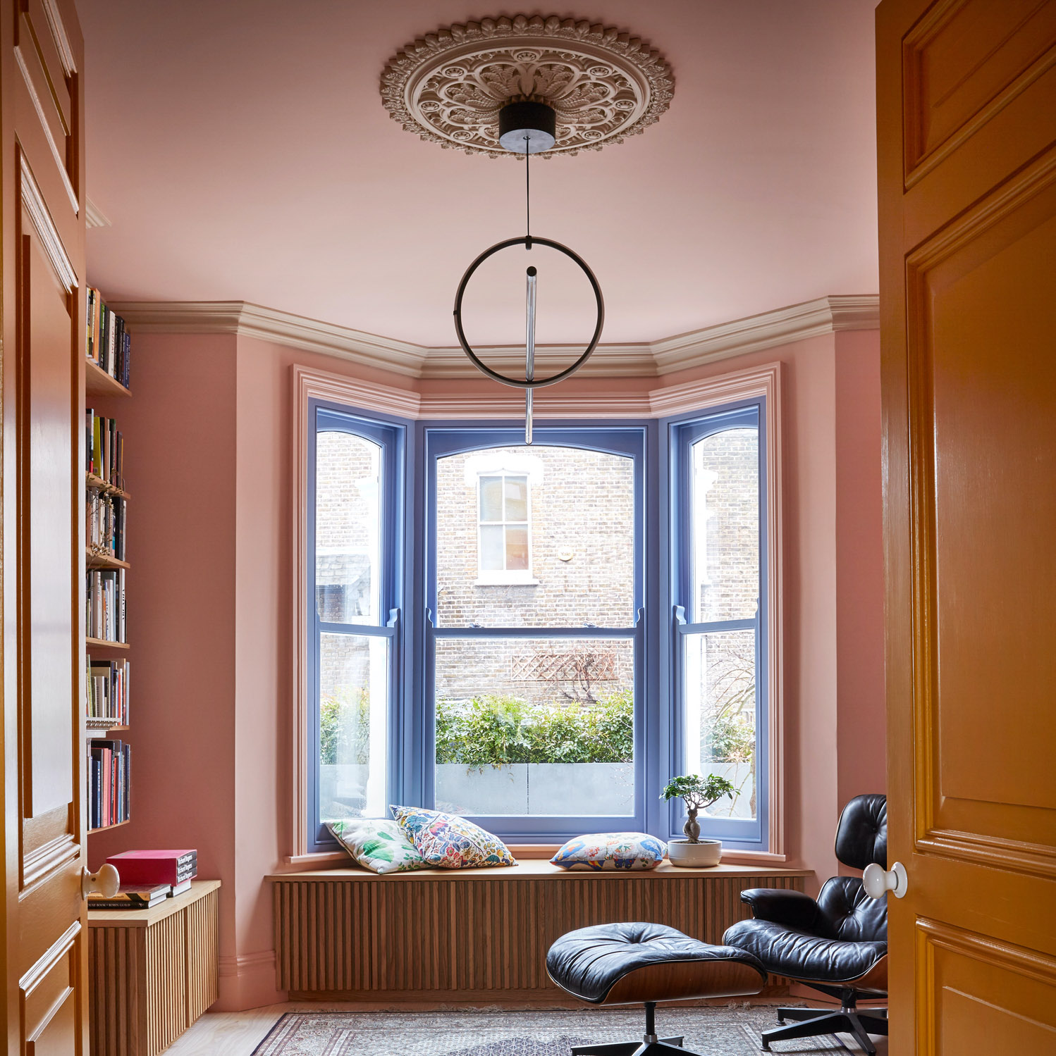
We added an internal glass panel between the shower and stairwell, as well as the bedroom and hallway, so that daylight is captured right in the middle of the rather narrow and deep house. There is also bespoke joinery in almost every room. There is storage in seats, under eaves and stairs – in old houses this is a fantastic space-saving solution. The window seat was a must-have; a small place with a strict “no-mobile” policy and just enough space for one’s own thoughts.
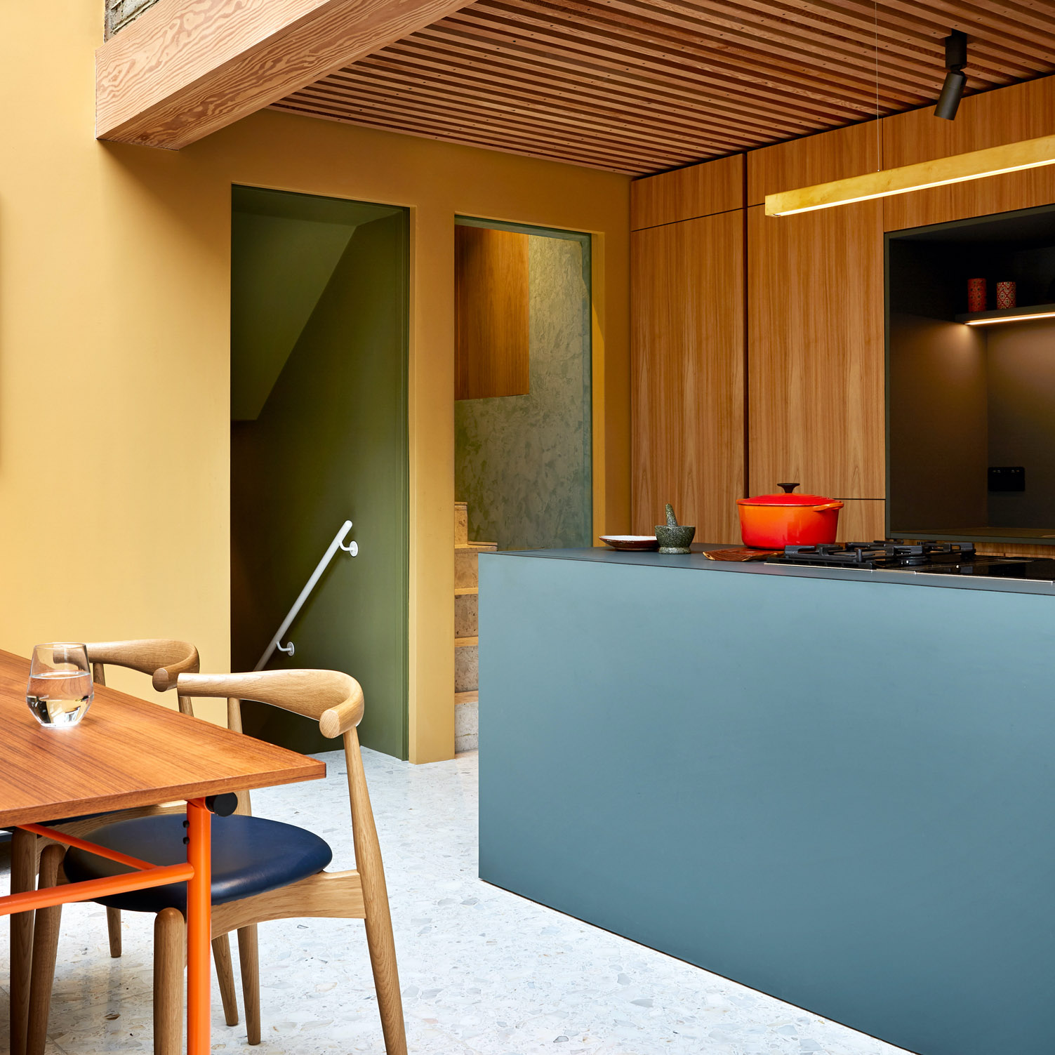
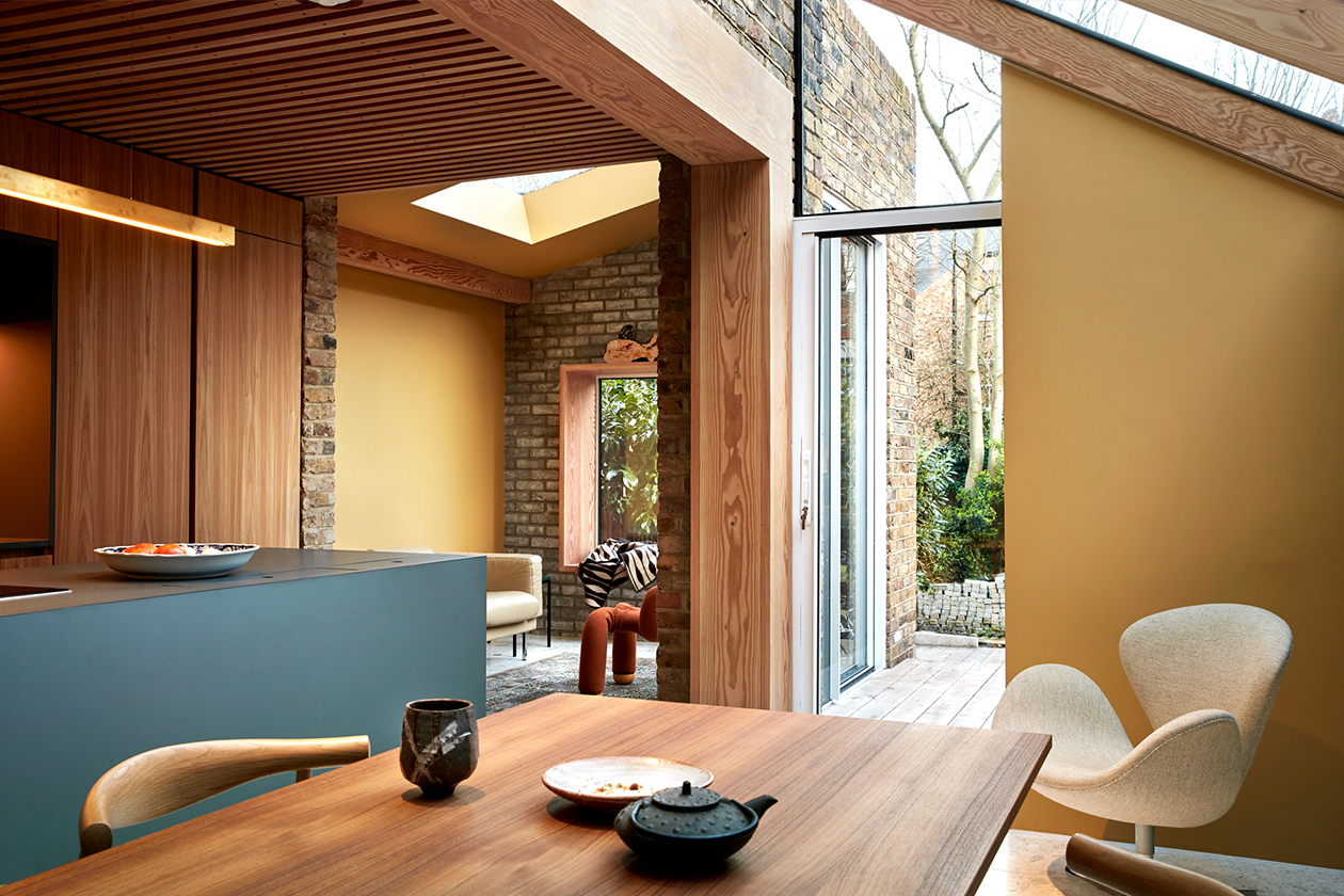
In the kitchen, many decisions had already been made about the use of materials and the kitchen fronts themselves, and here the goal was to strengthen Siri’s objectives for the room, and make the color work together with the chosen materials.
DTM: Tips / tricks to create magical nooks and crannies for children and adults:
SZ: Use humour, think about what is fun, and where you have the opportunity to do something different; utilise the space available. A place under a staircase can be a golden opportunity, if the ceilings are high you can both climb and swing. There are many more ways to experience a room than to just sit on a chair. The boys love to climb up the ladder wall and up into the top bunk, and in practical terms it means that a small bedroom has plenty of floor space. I’m now working on a cabin that has a secret room, the Mum’s cabin office, where she can hide from noisy kids to get her writing done!
DTM: What about the outside? Garden / rooms / areas – how do you optimize these?
SZ: Here are a few things that are incredibly important: avoid furniture and railings, and think about how the garden is experienced from the inside. If a room has large glass sections, what is immediately on the outside of the glass must be planned as an extension of the room inside. Plants in pots on the inside and outside is a very cheap and easy trick that works great. Having glass doors from floor to ceiling is completely meaningless if you look straight into the chassis of a seating area or straight into the side of a barbecue. Plan the outdoor areas based on the lines of sight from the inside. There is more and more research undermining the importance of biophilic design and connection with greenery – careful consideration of the spaces just outside your widows can really transform the internal spaces in a natural and healthy way.
I am very fond of making large steps and decking at different heights, as it creates great places to have breakfast outside, without having to close the view with outdoor tables, furniture or railings. If you can pull a little of the garden or the cladding into the building volume, such as a conservatory, a light well or just by breaking the facade, you immediately get a much more dynamic relationship between interior and outdoor space.
DTM: How do you place windows and doors?
SZ: Remember the climate we live in! My husband comes from Sydney, where it’s nice to be able to open up the whole facade, you don’t need that in Northern Europe. This is about letting light and nature come in through the glass throughout the year. Again, think about what it is we want to look at: there is a view, a garden, sky and light. Also remember that rooms need corners – furnishing against glass is very difficult: glass from wall to wall often does not work. In an extension we worked on for a family of five, we put in a corner window so that we could frame the birch forest and the beautiful flowering apple tree on one side. We also put in high windows in the kitchen so that you can see the sun changing colour from sunrise to sunset but without the neighbours being able to look in and see the family.
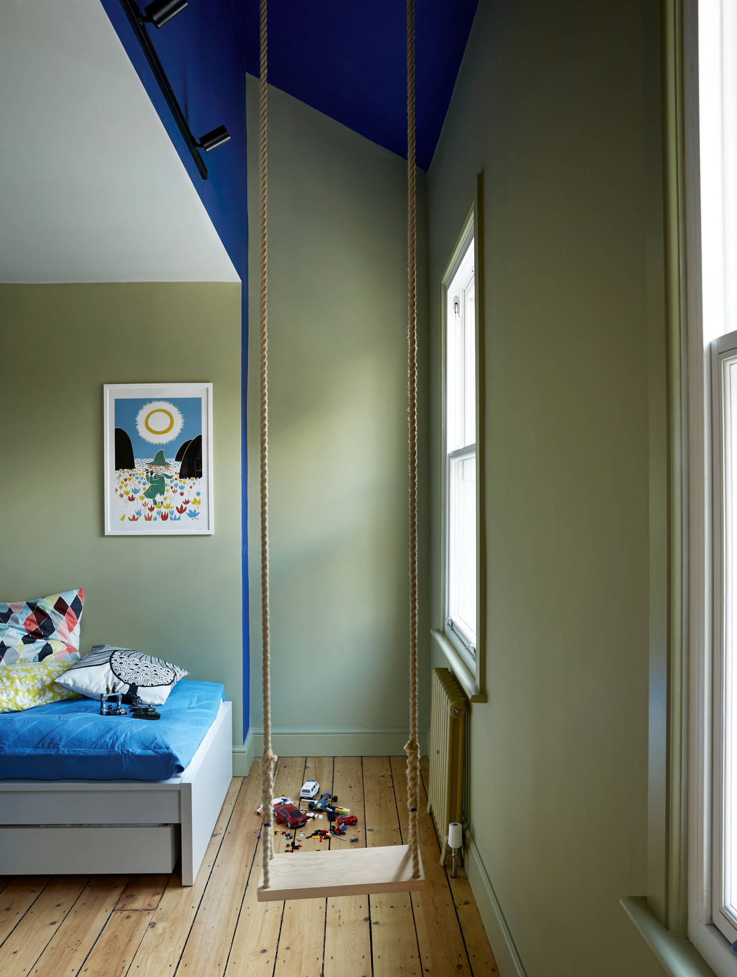
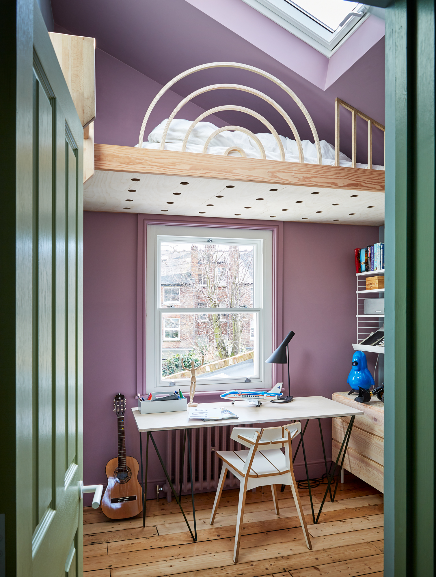
Odin’s bedroom (above left) clearly showed the niche that Dagny wanted to highlight – this is an exciting meeting between modern and classical architecture. Storm’s bedroom (above right) we had no idea what it was going to look like, and how magical details Siri had up her sleeve. But one thing was clear – he wanted purple!
DTM: How to choose a style when creating an extension – classic continuation or modern contrast?
SZ: Modern continuation! Working with historic buildings is great fun, and classic architecture, whether it is apartment buildings with high ceilings with beautiful cornices, or 1960s terraced houses with beautiful stair railings and ribbon windows. All of these buildings have good qualities you can take care of and maintain.
Contrast can be tiring, and architecturally it only works if the contrasting extension is meticulously detailed and executed by very knowledgeable contractors. The modern contrast, is in my opinion a higher risk option. When designing an extension in Highgate Conservation area, it was important to limit the planning risk and make sure the extensions were subservient to the host building.
In the Upside Down House, I chose to build the modern extensions with a lot of glass, but in classic “London stock” brick so that it is exactly the same facade material as the original house from the turn of the century. The new windows have sharper proportions, but the aluminium frames are white – just like the original timber windows. The extensions have a pitched and the angles are taken from the original house. In this way, it is clear what is new and what is old, but it is the historic main house that dominates, the modern extensions quietly compliment.
DTM: When should you work with an architect?
SZ: You should work with an architect if you want the project to sing, and you want it to be tailored to you and your family. No job is too big or too small. At the moment we are working on everything from a staircase, to extensions and new buildings. I often advise clients to start with a simple feasibility study so that you find out if you should expand, rebuild, or maybe just reorganise inside. Getting professional help to set the terms correctly can be what makes the project viable. I often tell my clients not to focus on size, but on quality.
Norwegian creative team behind Upside Down House


Siri Zanelli – architect and partner at Collective Works
Siri lives and works in London, and is a partner in the London office Collective Works. In addition, she is the owner of the house. Renowned architect in both Norway and London, Siri has worked for Rogers Stirk Harbour + Partners and Foster + Partners.
Dagny Thurmann-Moe – color designer and creative leader at KOI Studio
Dagny started KOI color studio in 2014, and has worked with Pure & Original for several years. She is one of the country’s foremost color experts, and works with coloring of architecture, interiors, institutions and products.
Margaret M. de Lange – photographer
Margaret is a very skilled interior photographer and is particularly good at light and cut. She has photographed all three campaigns we have worked on for Pure & Original, and KOI works as often as we can with Margaret on our projects showcasing Colour at Home. Among other regular clients are Slettvoll, Høie and several magazines both nationally and internationally.
Kirsten Visdal – stylist
Kirsten has worked in the interior design industry for a number of years and has also been involved in all three projects we have worked on for Pure & Original. The experiences she has gained from her jobs as an interior design consultant, stylist, art director, and not least the initiator and the brain behind Håndverk +, she brings with her on assignments both at home and abroad. Kirsten’s customer group includes everything from manufacturers, magazines to designers and architects. You may also have seen her in Time for Home, TV2, where she has been their designer for several years.
Let’s have a chat about your vision and
how we can help you realise it.
Collective Works are an architecture & design studio. Our network of professionals will create your perfect solution.