Tidy Up Time
< Back to Projects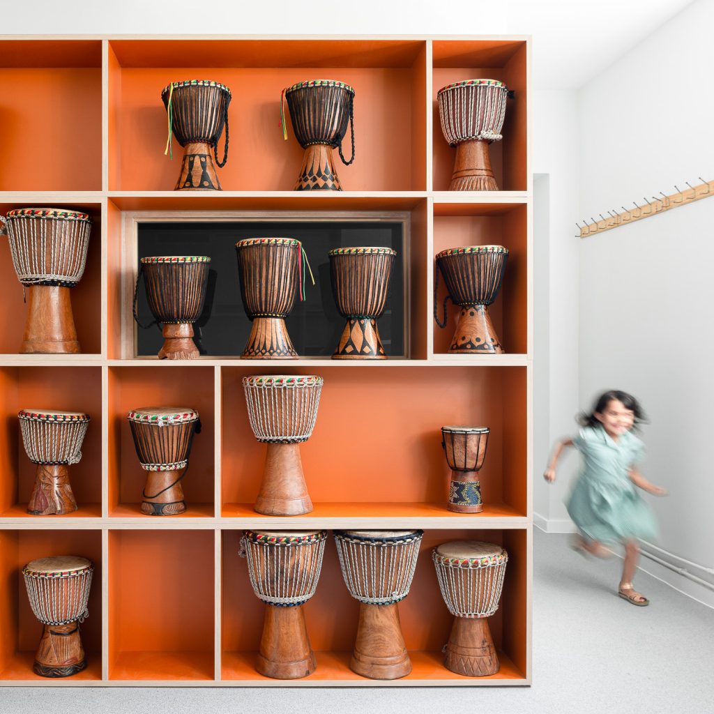
Our client, the Head Teacher, gave us a simple brief: that he wanted comfortable spaces where the staff and teachers could take a break from the children. We politely insisted we didn’t want to take his word for it. Instead, we requested a conversation with his team. Stakeholder involvement is the key to a successful project.
Designing with the nursery staff
We organised a workshop inviting teachers and staff alike to tell us what worked and what could use improvement. With post‐its, pens and big sheets of paper we avoided architectural language and found out what changes to the building would actually be better for them. And it turns out, their priority was not quite what the head had imagined: they didn’t want space to relax but instead to work more efficiently. We needed to tidy up the staff rooms, to enable better concentration and organsiation.
Working with existing buildings requires an understanding of how they are used before being able to design improvements. A decade earlier, Matthew Lloyd Architects had expanded the school and sensibly organised the learning areas to radiate around the reception and administrative zone. In recent years, the growth of the student body and teaching staff blurred this clear organisation.
Beautiful spaces for wellbeing
Children were brought into admin spaces due to an increased need for rooms; teachers did not have a dedicated space to focus on their admin tasks; the role of Head and Deputy Head diverged into outward and inward‐facing capacities making a shared office no longer appropriate. Alongside these observations, we realised that walking routes crept into the larger spaces resulting in inefficiency. And lastly, not enough attention had been paid to the experience of regularly invited visitors and external bodies.
We knew we had to emphasise to the children the original division of the building: an open‐plan learning space where they could roam freely and a boundary beyond which were smaller, enclosed spaces in which they needed adult invitation. Then, we set about subdividing some of the larger, inefficient rooms into separate spaces planned for specific users and purposes. These rooms were developed in close consultation with the respective users to make sure they were fit‐for‐purpose.
Colour as a design tool
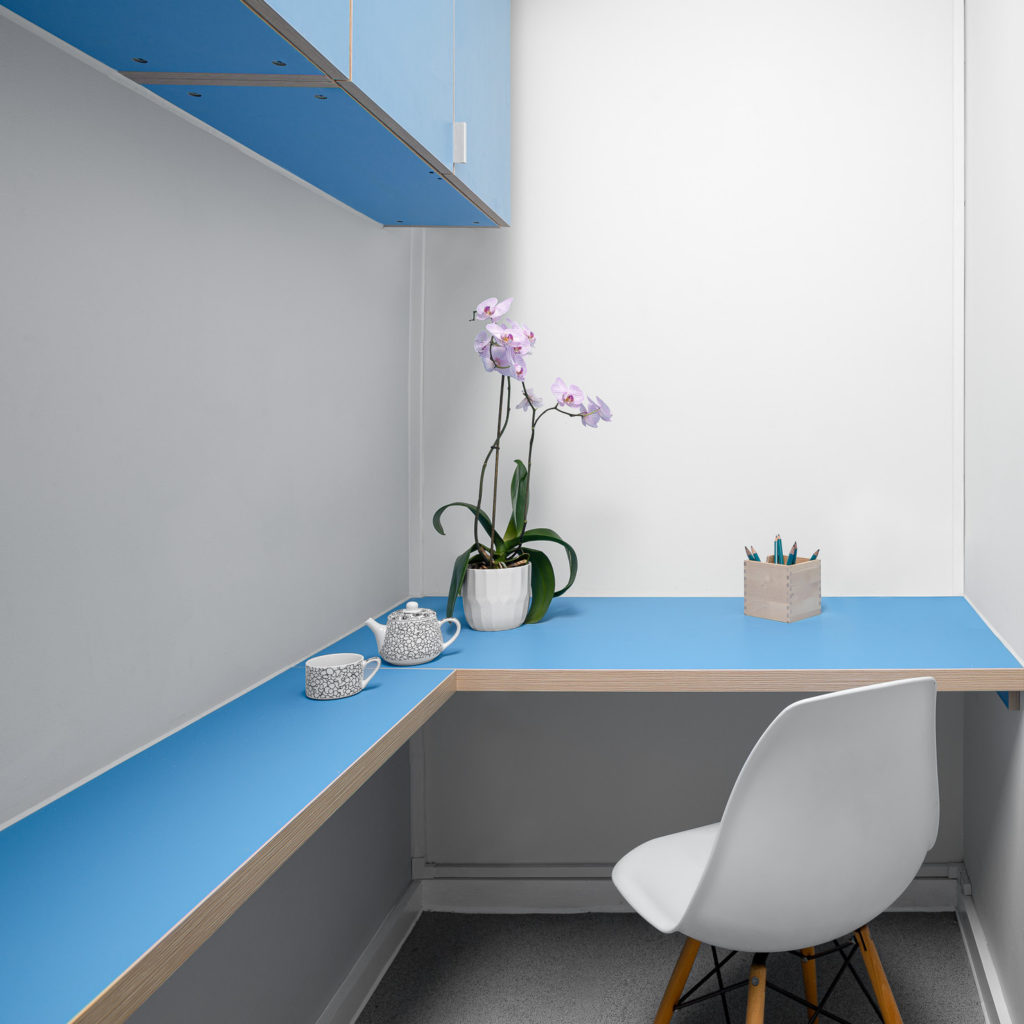
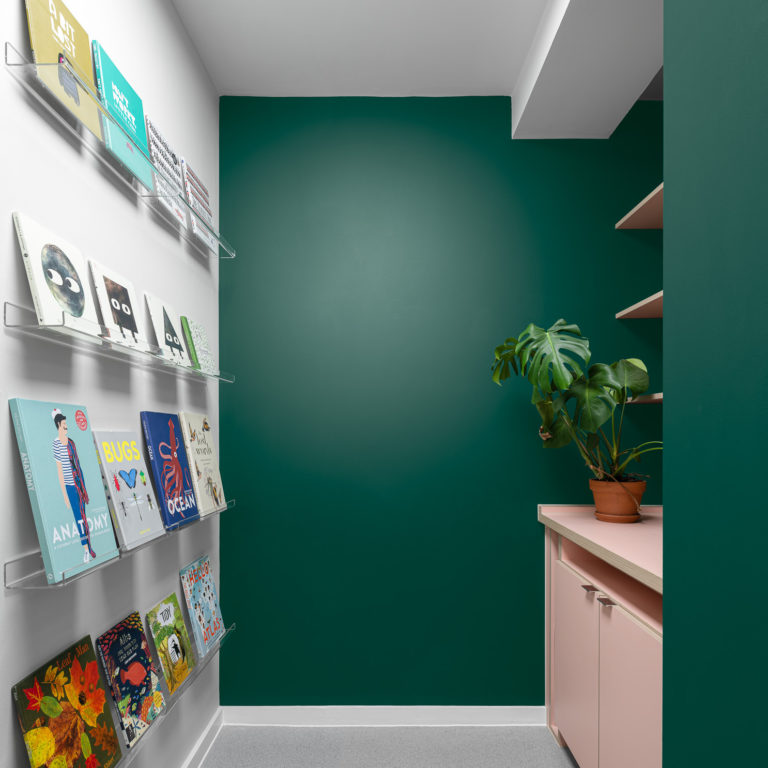
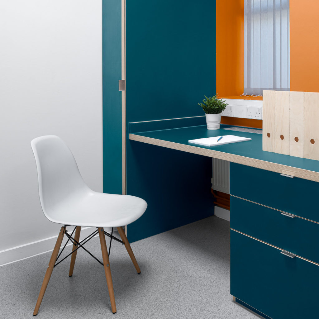
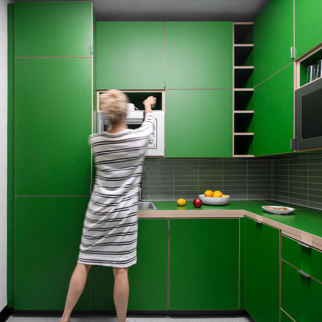
Colour was one of our two primary design interventions. We knew it was cost‐effective to implement, could personalise spaces, and provide a degree of playfulness that was appropriate. All the staff members chose their favourite colours, and we created palettes and chose materials based on their input.
For the rooms, we developed a typology of a background colour that could be applied throughout and then one bold colour of the user’s choice.
Bespoke joinery adds space
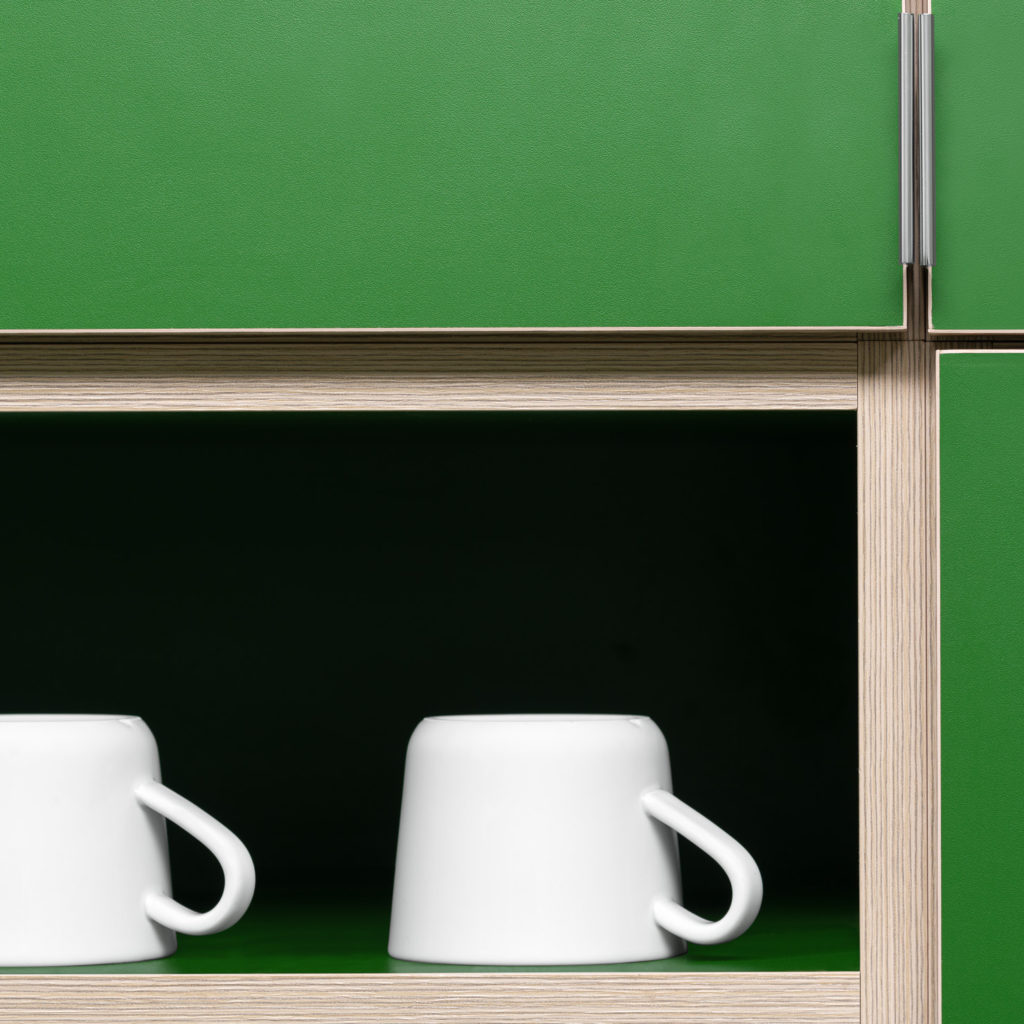
The second essential design idea was the use of custom joinery. Once again consultation with specific users was key. We took advantage of the full height of rooms and made sure that there were doors to all the units. This increased the amount of overall storage available but also decreased the visual clutter such that rooms felt better proportioned even if smaller in area.
Looking to
Transform your Home?
Unsure where to start? Drop us a line to hear about a range of services tailored to your needs.
Contact us